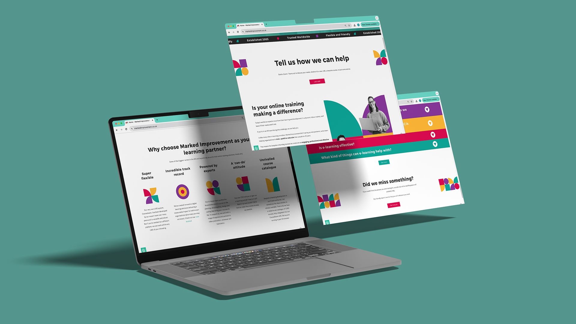
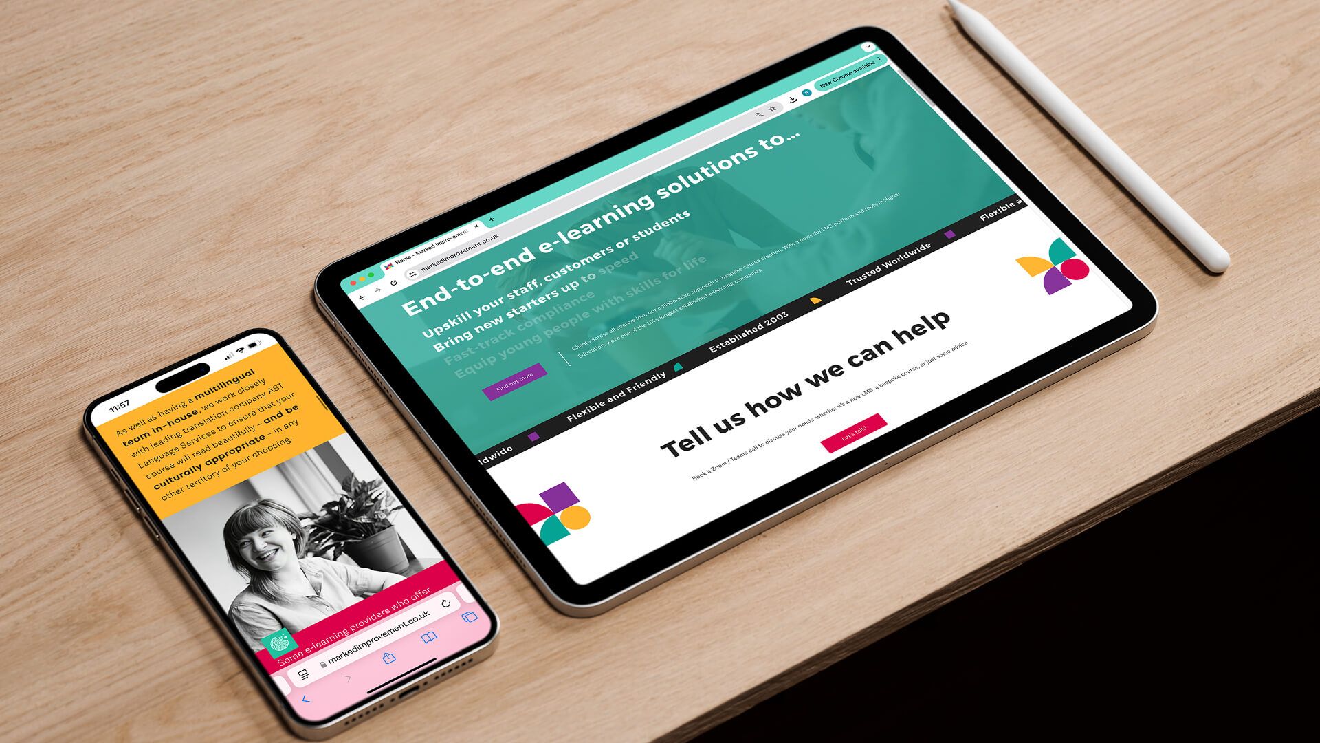
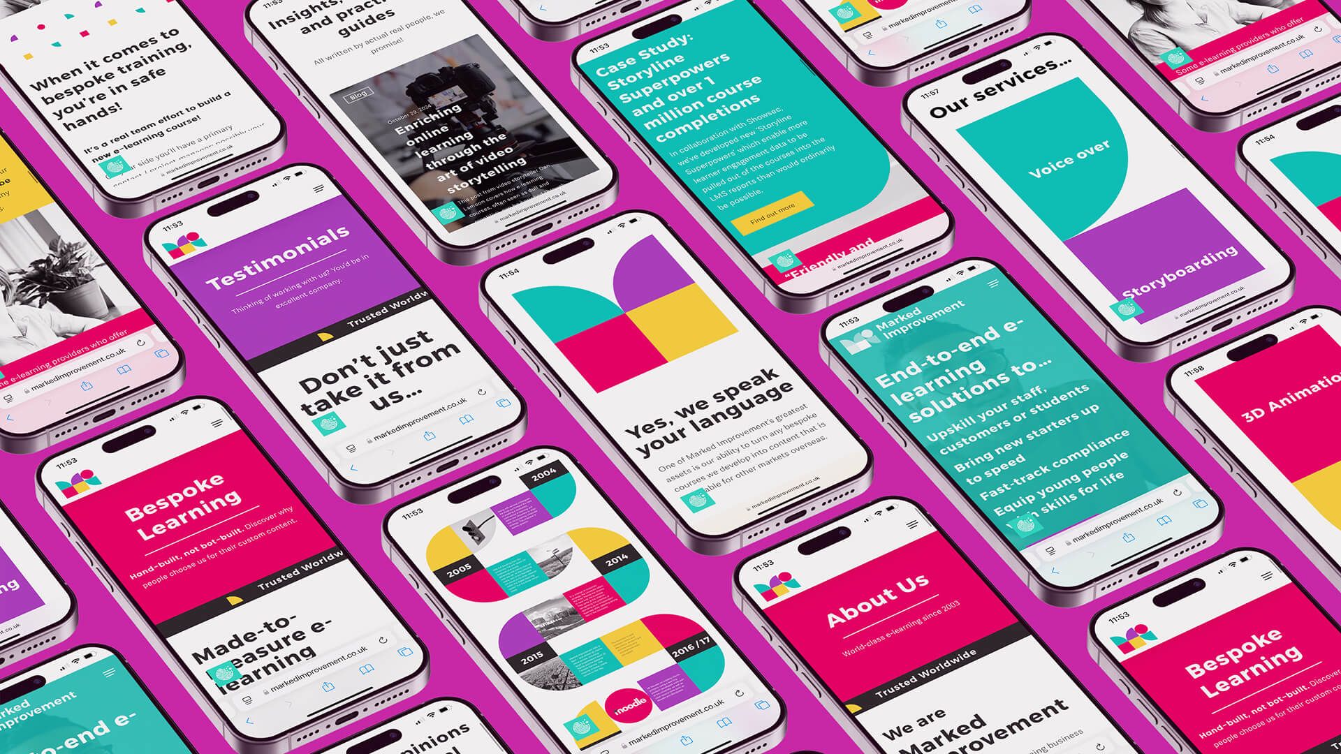
Marked Improvement mobile website screen designs by On Poynt Creative
Marked Improvement2025

Branding

Built to stand out on every stationery pile and pitch deck.

The Challenge

Mark's Improvement came to us for a classic rebrand. Founder Charles wanted something fresher than the stuffy e-learning platforms on the market. The original brand, made by a friend, had grown with the business but no longer reflected the quality of their products, including a service that lets customers build custom learning platforms from existing courses. They needed a brand that matched.

The Approach

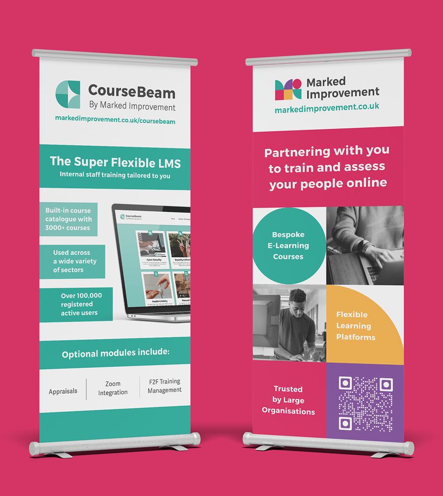
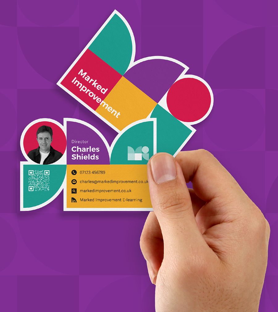
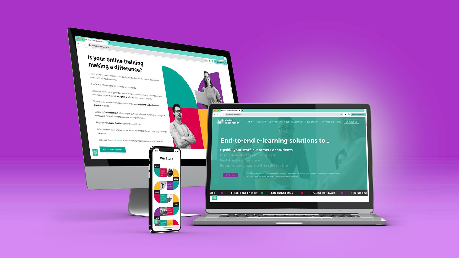
We built a blocky, geometric brand that looked like it could be plugged and played together, mirroring their modular learning platforms. A primary palette in vivid, punchy colour gave real standout against the more muted competitors. We extended it into an interactive event leaflet with spinning wheels, brand stationery, business cards, brochures and roller banners, and designed a website for the team to build.

The Outcome

The fresh brand identity stood out sharply from the competition and helped Mark's Improvement look more established, opening doors to bigger tenders and better opportunities in the e-learning space. It portrays the quality they deliver and gives them room to grow, another example of us handing clients strong, buildable assets and the freedom to take them forward independently.
Client perspective

n/a

n/s

Related work

View a similar project

Selected by category with a curated fallback so there is always something relevant to continue to.

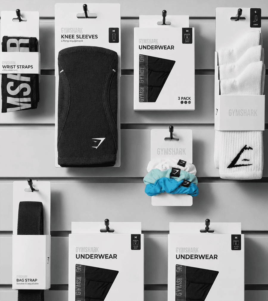
Gymshark accessory packaging displayed on a retail store wall
Retail

Gymshark Case Study

We partnered with Gymshark to organise a complex network of packaging, trims, labels and product information into one connected global resource. The result gives internal teams, suppliers and manufacturers the clarity they need to work efficiently, consistently and creatively.

View Project
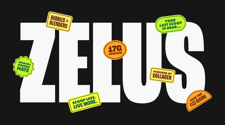
Zelus bold wordmark logo design with badge branding elements, by On Poynt Creative
Branding

Rebrand for Zelus

Zelus had created a sparkling protein drink that felt lighter and easier than traditional shakes, but the brand still looked clinical and medicinal. We evolved the identity into something energetic, social and full of personality, giving the product a stronger platform for growth beyond conventional gym culture.

View Project
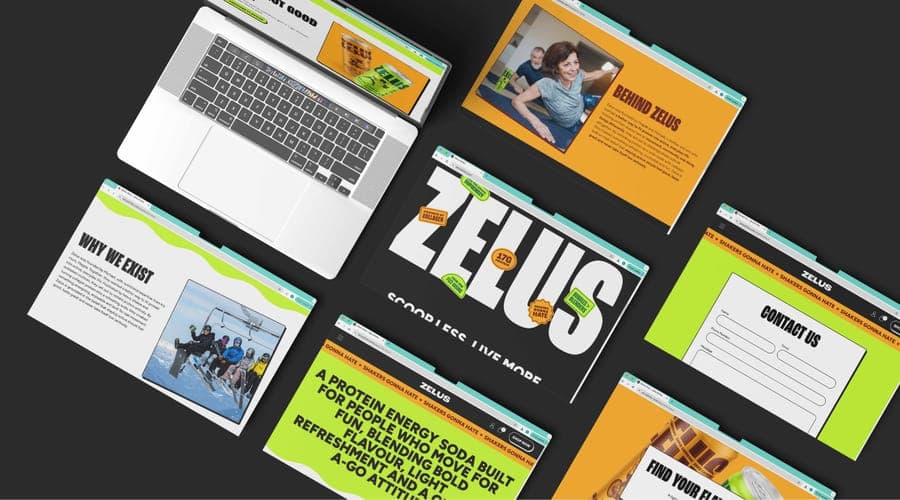
Collage of Zelus website page mockups including about and contact
Websites

Zelus Website

A bright, punchy Shopify website built on the brand we created for a vibrant drinks brand. Bold RGB colour and brand-led tone drive direct and bulk ordering, opening a promising new sales channel with padel and badminton clubs.

View Project
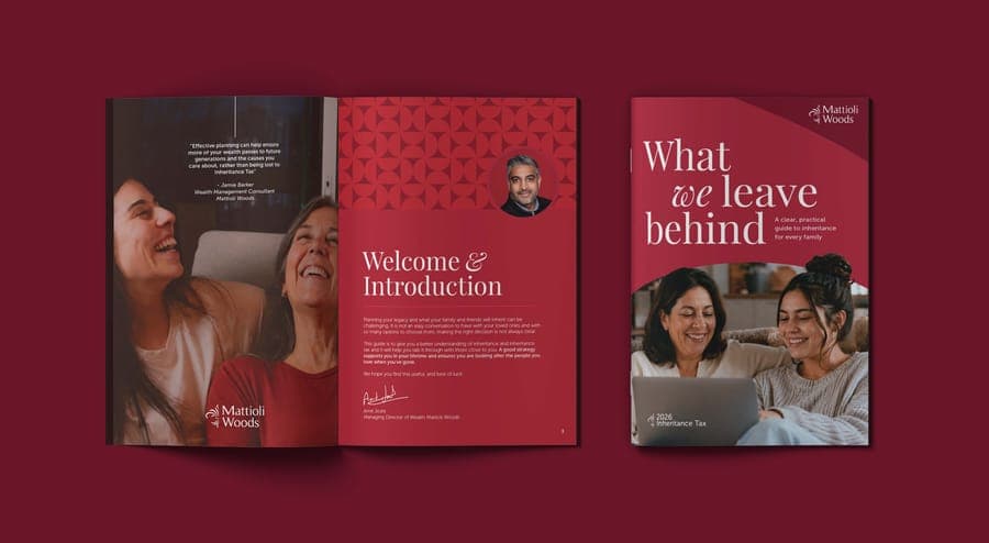
Mattioli Woods IHT Brochure
Editorial

Mattioli Woods Publication

Designed and produced a comprehensive inheritance tax planning guide for Mattioli Woods, translating complex financial information into an accessible, client friendly publication.

View Project
Gymshark Packaging
Retail

Gymshark Packaging

Retail product packaging for Gymshark's move from ecommerce into stores. We ran a branding-style process across three creative routes, then rolled out packaging across every SKU on an ongoing retainer, keeping the shelf experience as considered as the brand.

View Project
Doughlicious cookie dough dessert box packaging repeated pattern flat lay in red and blue, packaging design by On Poynt Creative
Packaging

Doughlicious Packaging

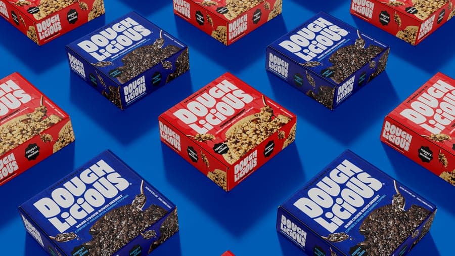
Mouth-watering packaging for a cookie dough dessert brand extending into shareable skillets. We built a flexible system across flavours with 3D renders and print-ready files, making the product look good enough to eat and ready to pitch to retailers.

View Project

CREATIVE & BRANDING AGENCY

WHERE CREATIVITY, STRATEGY AND PURPOSE CONVERGE TO BUILD BRANDS PEOPLE BELIEVE IN

2026®