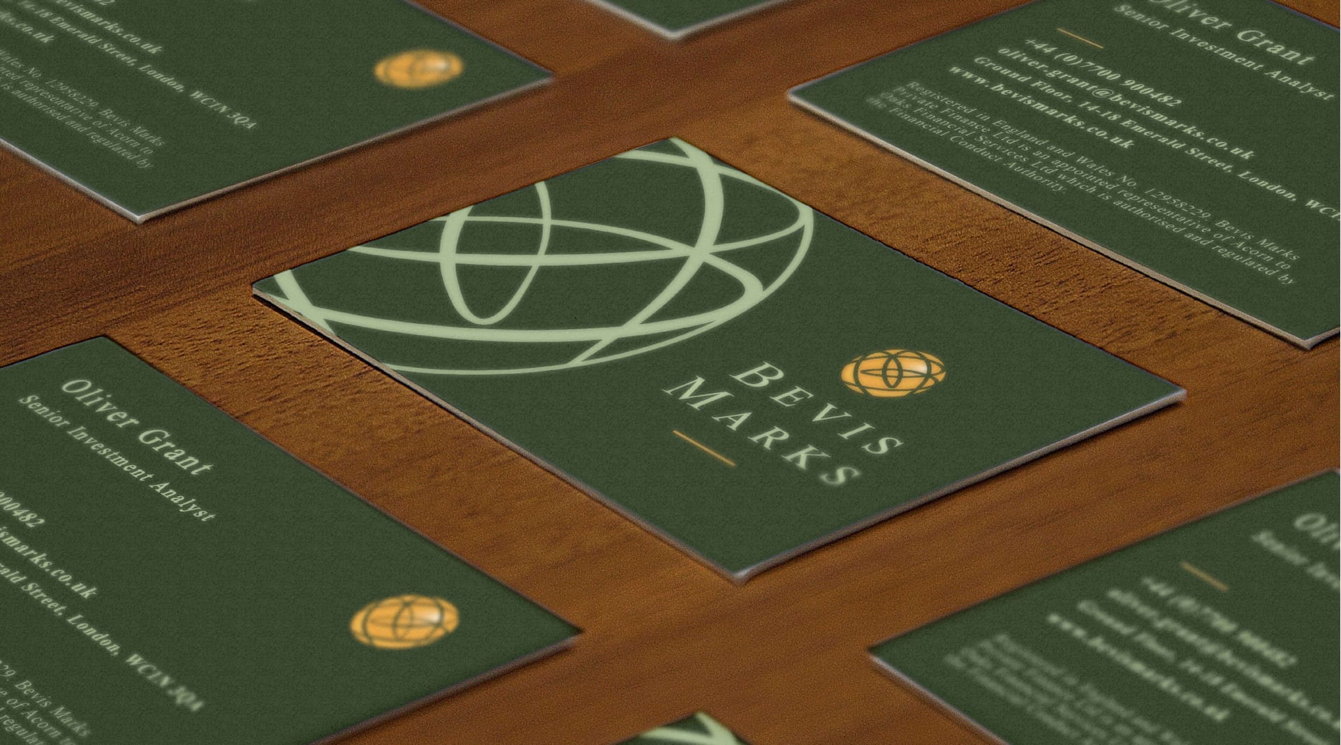
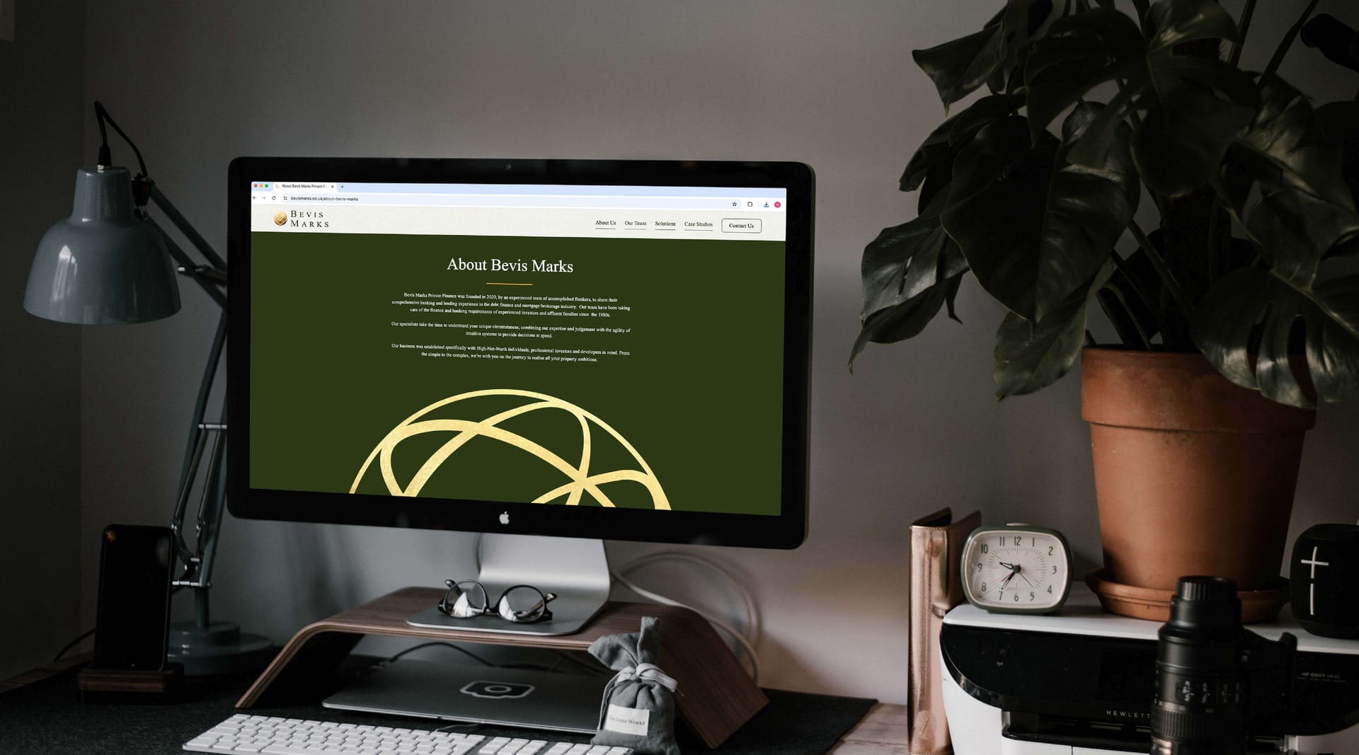
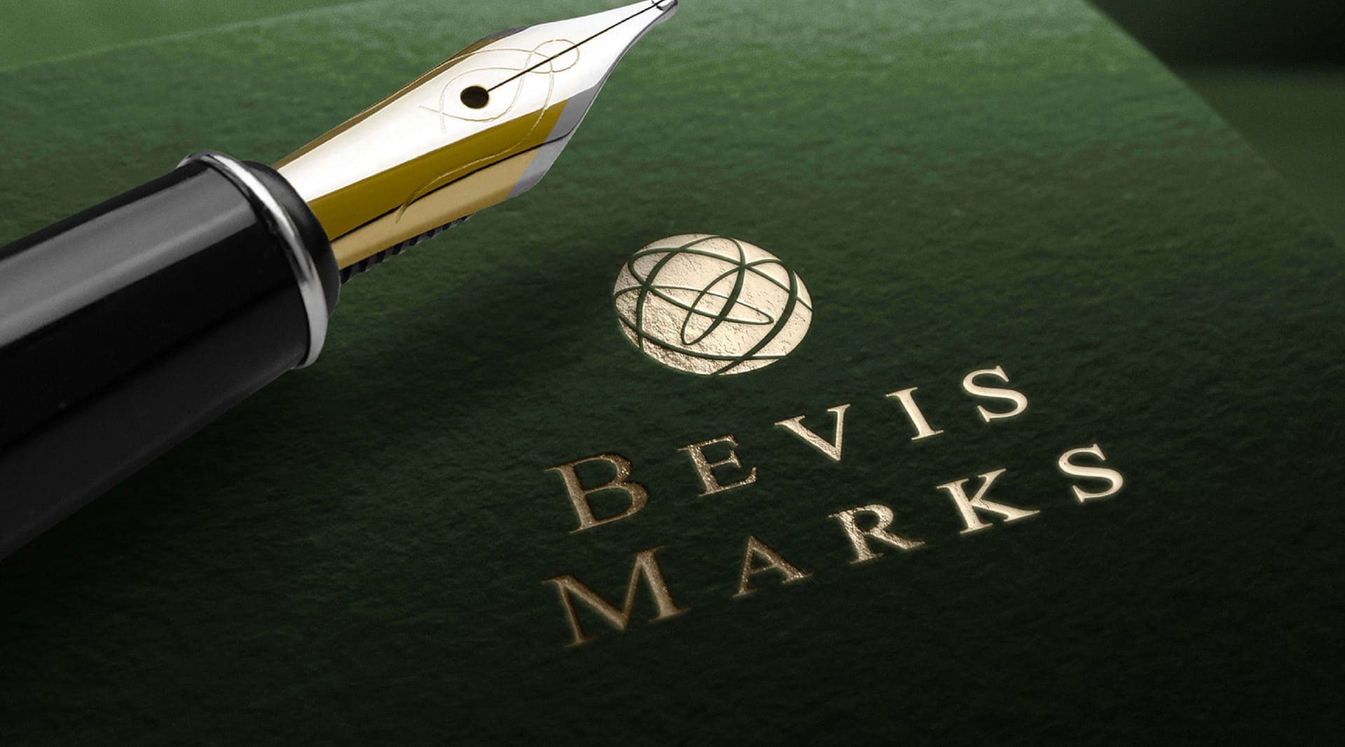
Bevis Marks logo embossed on premium packaging with gold pen, by On Poynt Creative
N/AN/A

Premium brand identity for finance brokers

THE PERSONAL SIDE OF FINANCE

The Challenge

Bevis Marks was founded by three finance brokers from London's Canary Wharf who felt corporate banking had lost its personal touch. They wanted to bring back a more personal kind of finance, while keeping the premium feel their high-flying clients expect. The challenge was a finance brand that felt both trustworthy and expensive, in the world of Rolex and Wimbledon.

The Approach

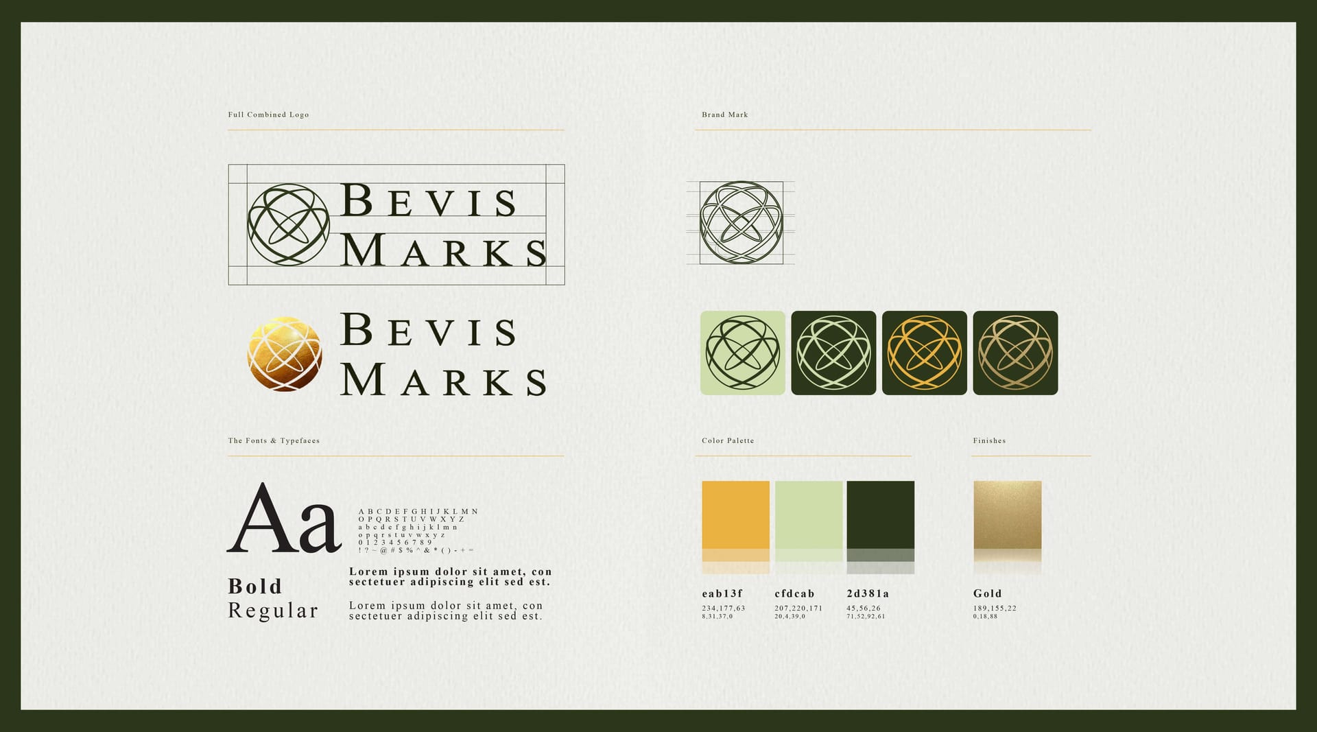
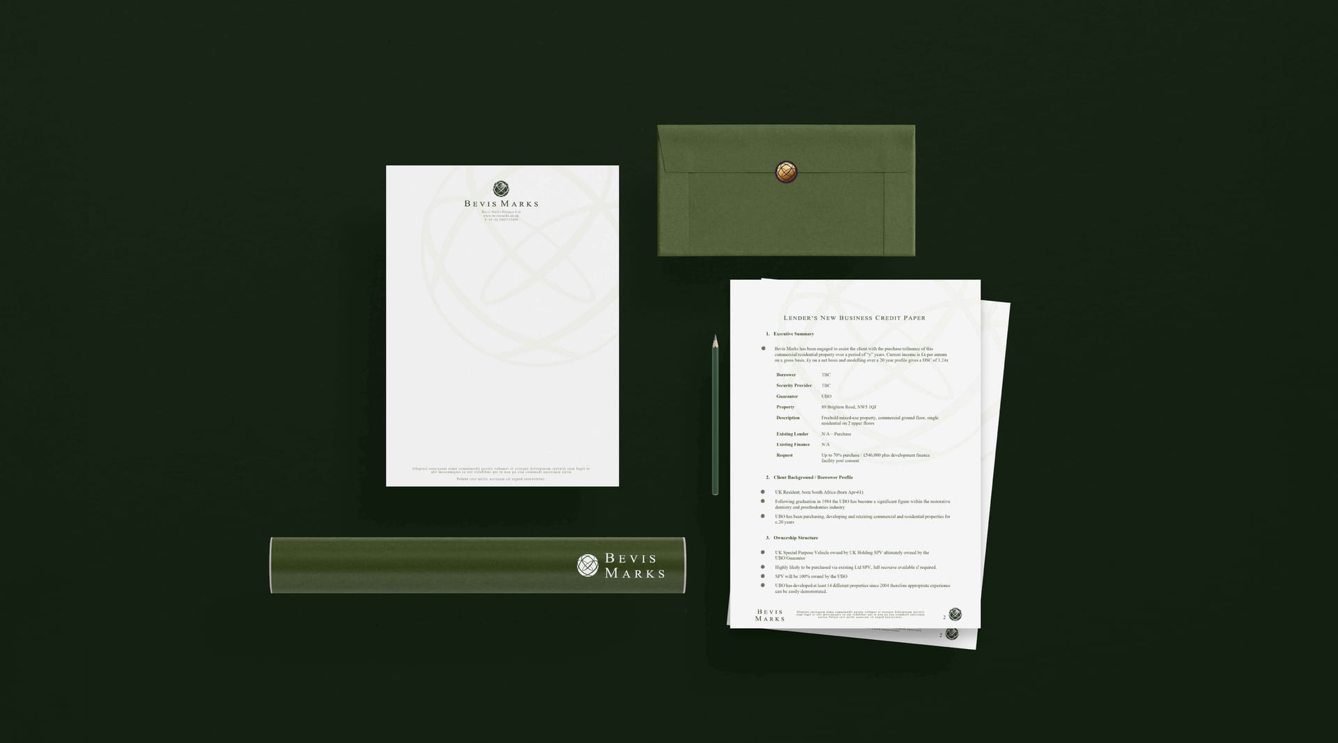
We designed a dark, sophisticated palette of deep greens, purples and blues that told a story of something expensive and dependable. The language drew on their name and their standout advantage, deep contacts across banking. A globe icon with orbiting rings sits at the centre, with a hidden B and M worked into the roundel, extended across business stationery and their website.

The Outcome

The brand has carried Bevis Marks through a significant period of growth, now employing eight staff and building out steadily. They have kept the essence of the business close, so the financial services branding still says exactly what they want it to. It is proof of an identity that looks premium, earns trust and grows with the company behind it.
Client perspective

n/a

n/s

Related work

View a similar project

Selected by category with a curated fallback so there is always something relevant to continue to.

Slice & Dice pizza box branding design, by On Poynt Creative
Print

Slice & Dice

A Las Vegas themed pizza kiosk built around a simple hook: buy a slice, roll a dice, maybe win another. We designed the kiosk, signage, uniforms, social and packaging, then scaled it as the concept grew from Oxfordshire to London.

View Project
Opal 22 Pop Up Poetry event poster design, by On Poynt Creative
Print

Opal 22

Illustration-led branding for a Leicester Black heritage charity's flagship Black History Month events. We gave each event its own identity across a brochure, posters, leaflets and merchandise, creating cohesive assets the charity now owns and reuses year after year.

View Project
Endeavour Adventures website design displayed on laptop with mountain sunset backdrop, by On Poynt Creative
Branding

Endeavour Adventures

A scout-badge inspired brand refresh for a youth adventure holiday business. We updated the logo and built brochures, roller banners and social frames, giving a proven outdoor operator a fresher, more commercial and more trustworthy look built for growth.

View Project

CREATIVE & BRANDING AGENCY

WHERE CREATIVITY, STRATEGY AND PURPOSE CONVERGE TO BUILD BRANDS PEOPLE BELIEVE IN

2026®