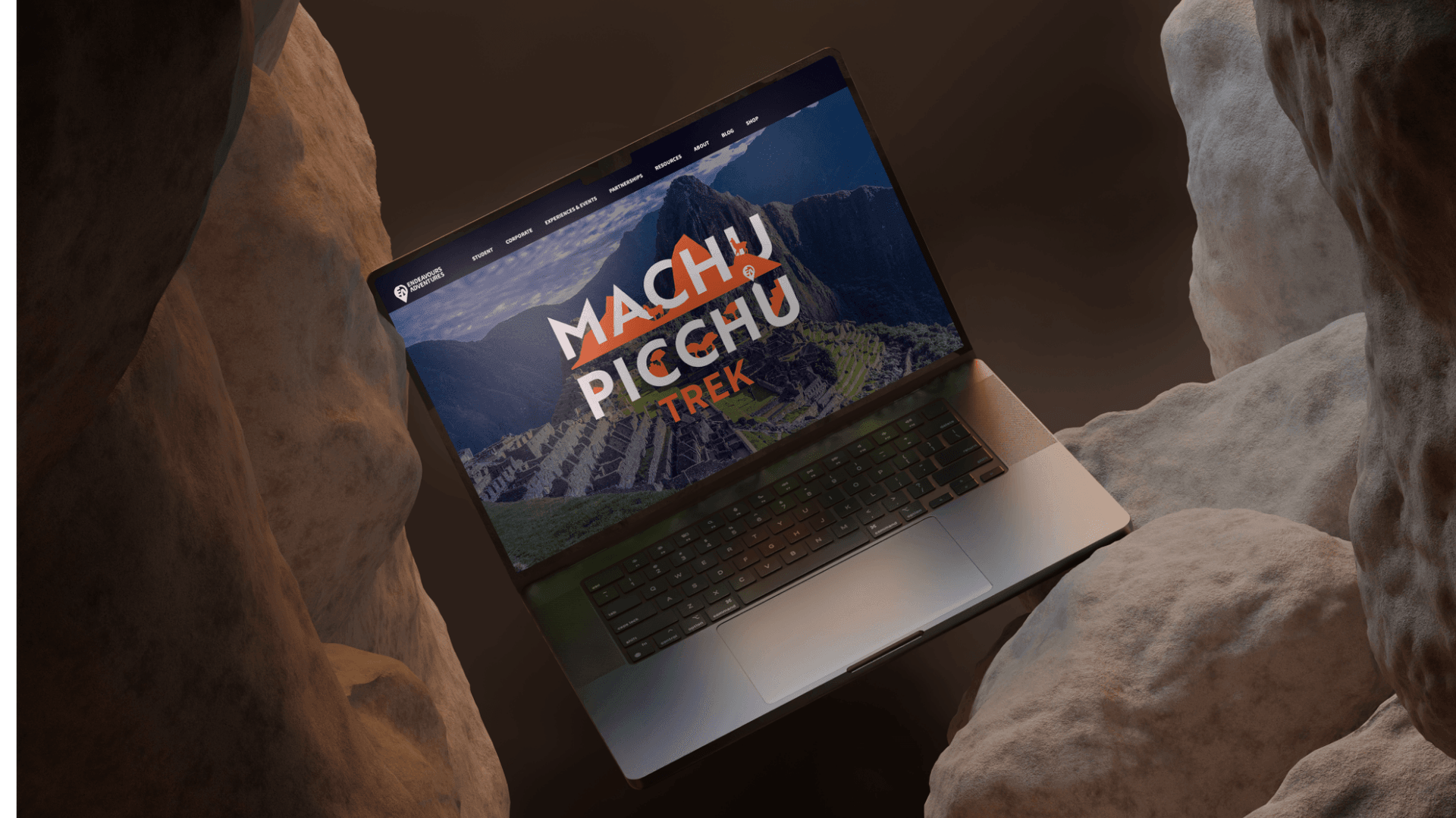
Endeavour Adventures website design displayed on laptop with mountain sunset backdrop, by On Poynt Creative
N/AN/A

Youth adventure brand refresh

MADE FOR THE WILD

The Challenge

Endeavour Adventures, a successful youth adventure holiday business, wanted to sharpen a brand that had served it well but felt dated. The owner wanted something fresher and more distinctive that captured the narrative of the adventures themselves, gave the business more personality, and reflected the exploration, wilderness and challenge at the heart of what they offer to young people.

The Approach

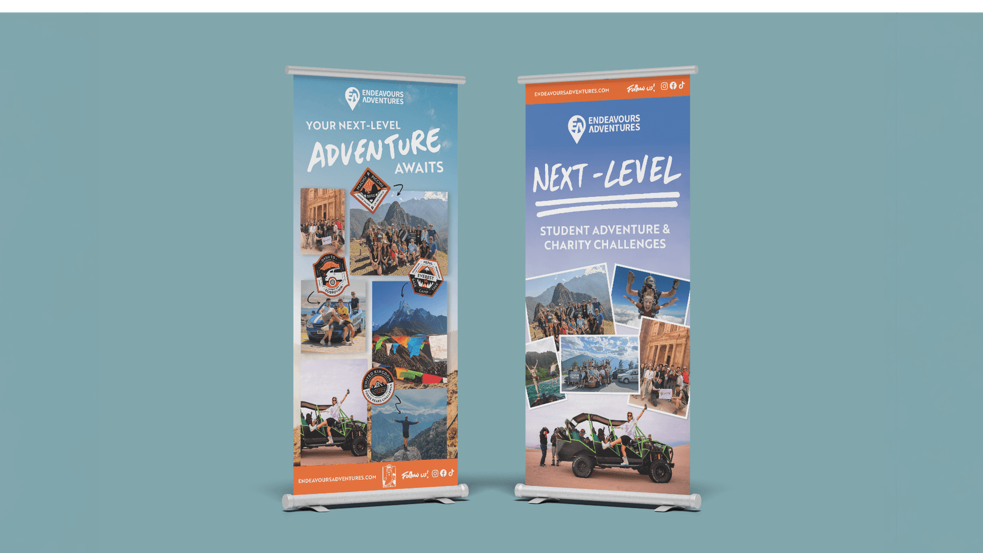
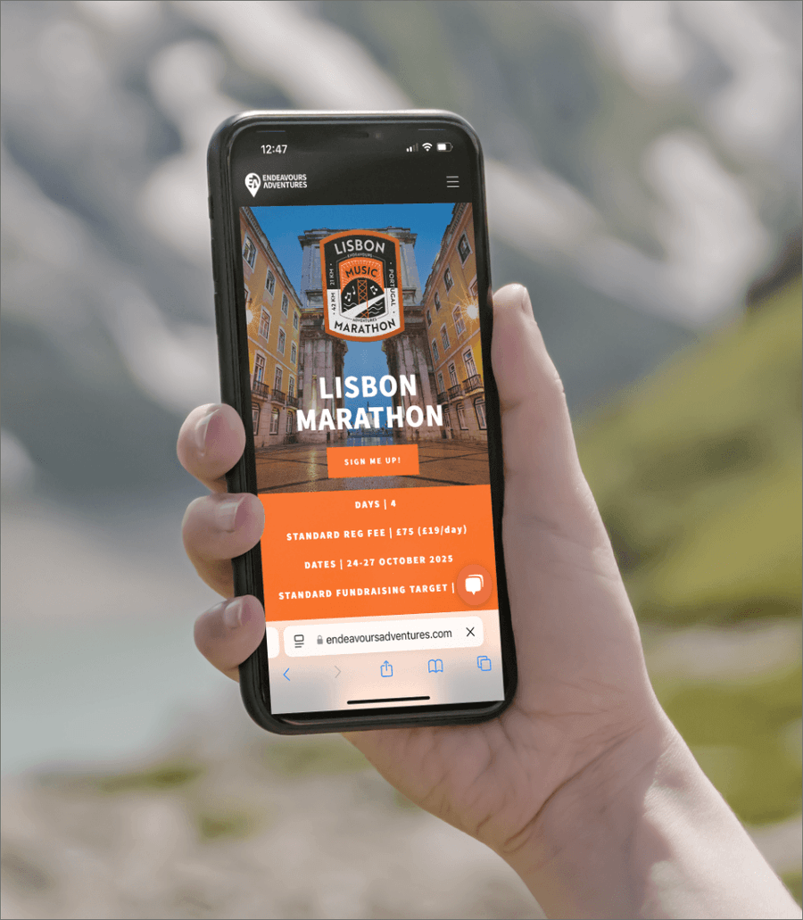
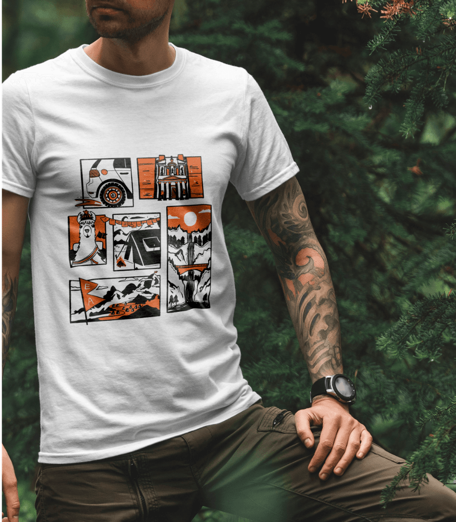
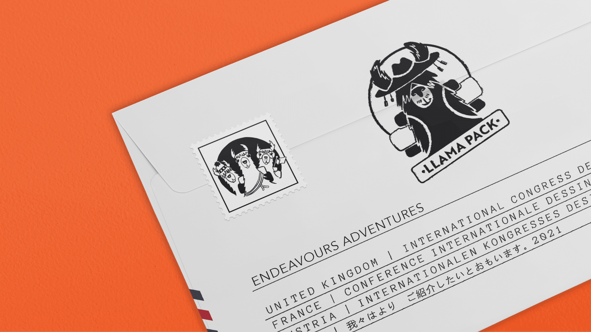
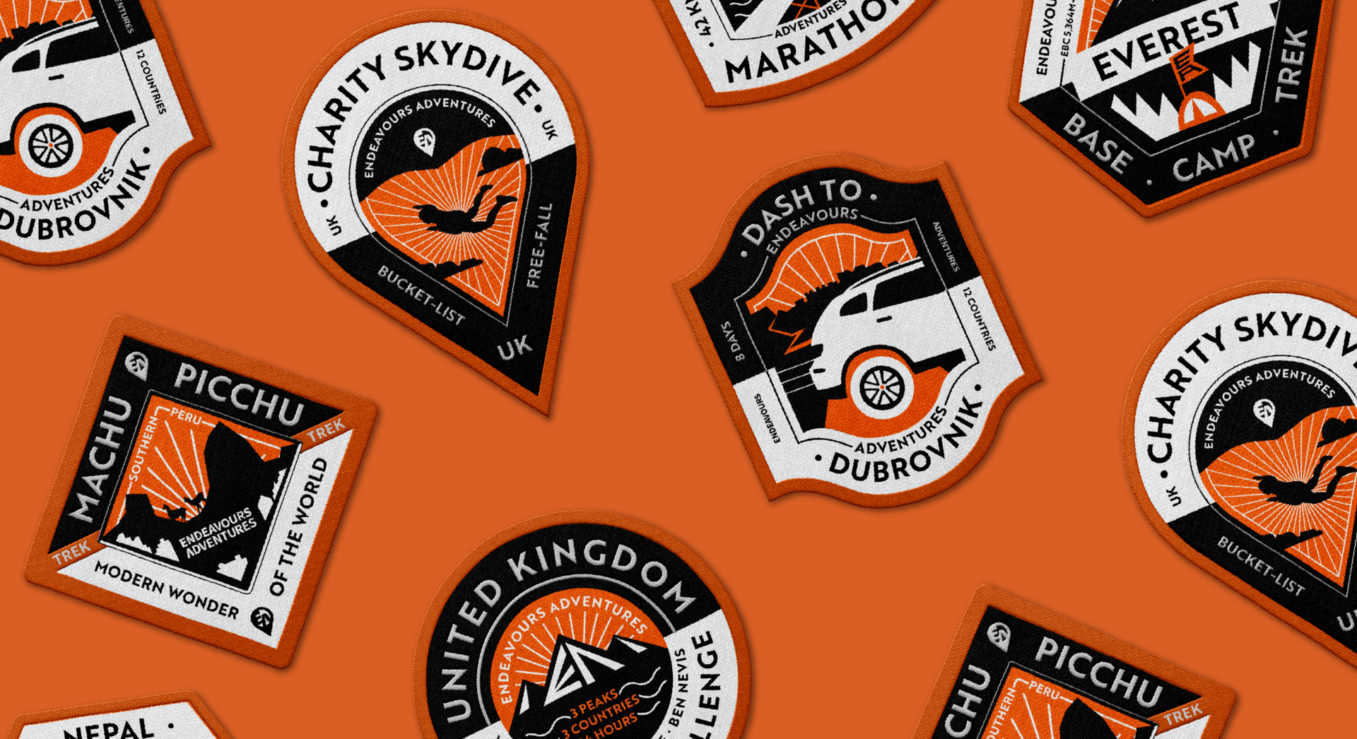
We built the brand around scout-style badges that celebrated exploration, hikes and time in the wild, with a confident, Bear Grylls-esque tone of voice. It was a light-touch refresh, updating rather than replacing key assets like the logo, then extending it into brochures, roller banners for student union events, social frames for user generated content and templates to brand individual adventures online.

The Outcome

The refreshed brand now looks far more commercial and trustworthy, reassuring young people and parents investing in premium adventure holidays, especially in a post-COVID travel market. It has already helped the business partner with high-profile challenges, including a series of runs across Africa with the Hardest Geezer. The brand refresh gave a proven outdoor business the credibility to match its ambition.

Client perspective

n/a

n/a

Related work

View a similar project

Selected by category with a curated fallback so there is always something relevant to continue to.

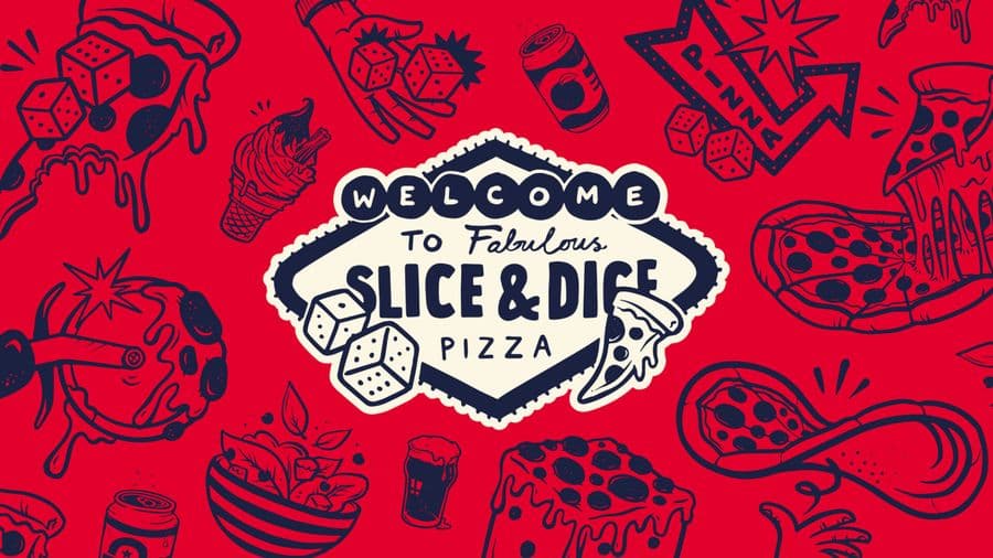
Slice & Dice pizza box branding design, by On Poynt Creative
Print

Slice & Dice

A Las Vegas themed pizza kiosk built around a simple hook: buy a slice, roll a dice, maybe win another. We designed the kiosk, signage, uniforms, social and packaging, then scaled it as the concept grew from Oxfordshire to London.

View Project
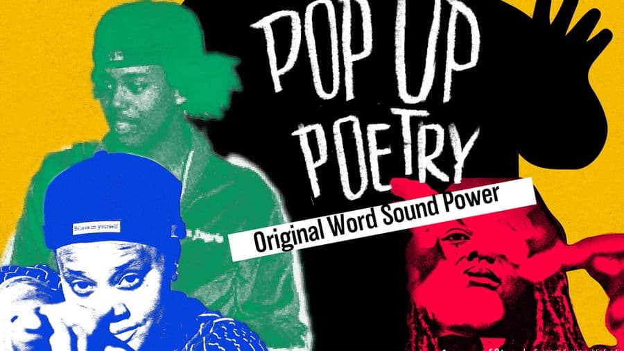
Opal 22 Pop Up Poetry event poster design, by On Poynt Creative
Print

Opal 22

Illustration-led branding for a Leicester Black heritage charity's flagship Black History Month events. We gave each event its own identity across a brochure, posters, leaflets and merchandise, creating cohesive assets the charity now owns and reuses year after year.

View Project
The Inside Edge logo design printed on textured card, branding by On Poynt Creative
Branding

The Inside Edge

A bold rebrand for a team training business founded by an ex-Army captain and England cricketer. Concrete textures, distress and sharp typography blend sport and military into one confident brand identity, complete with full guidelines built for future growth.

View Project

CREATIVE & BRANDING AGENCY

WHERE CREATIVITY, STRATEGY AND PURPOSE CONVERGE TO BUILD BRANDS PEOPLE BELIEVE IN

2026®