The Challenge
Mark's Improvement came to us for a classic rebrand. Founder Charles wanted something fresher than the stuffy e-learning platforms on the market. The original brand, made by a friend, had grown with the business but no longer reflected the quality of their products, including a service that lets customers build custom learning platforms from existing courses. They needed a brand that matched.
The Approach
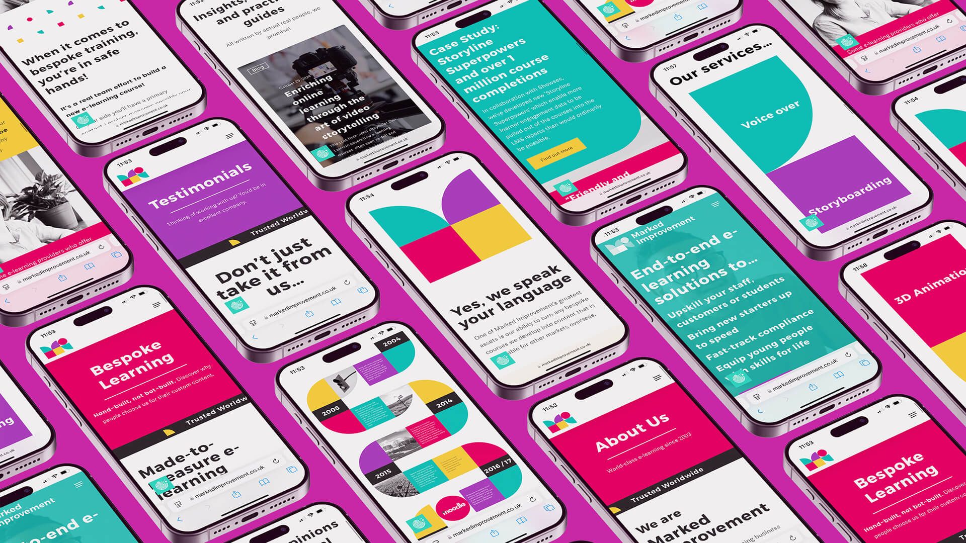
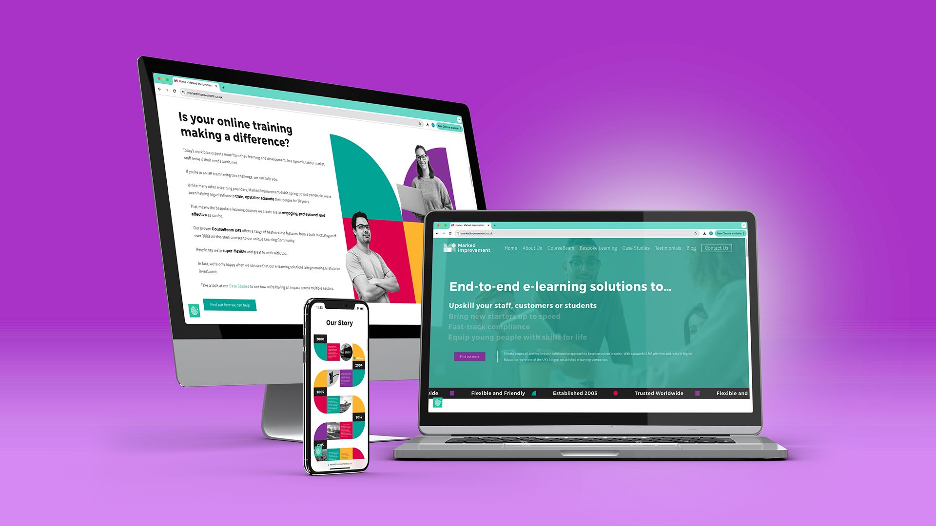
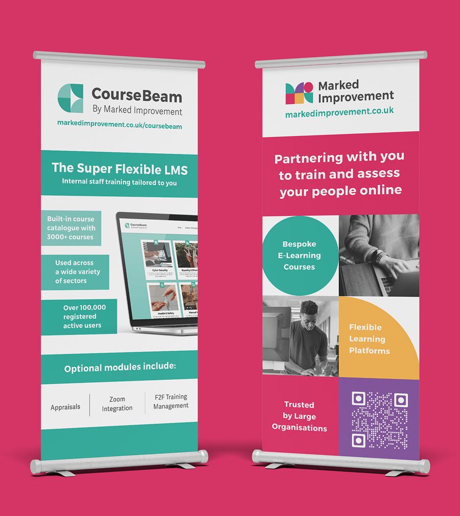
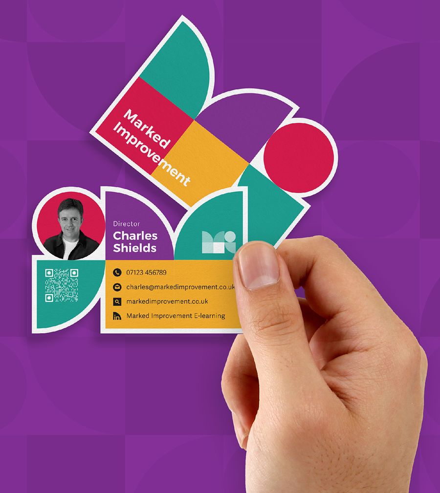
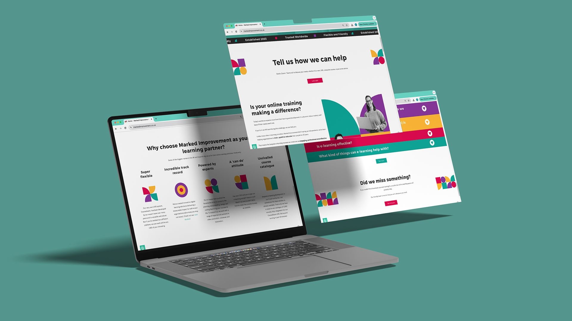
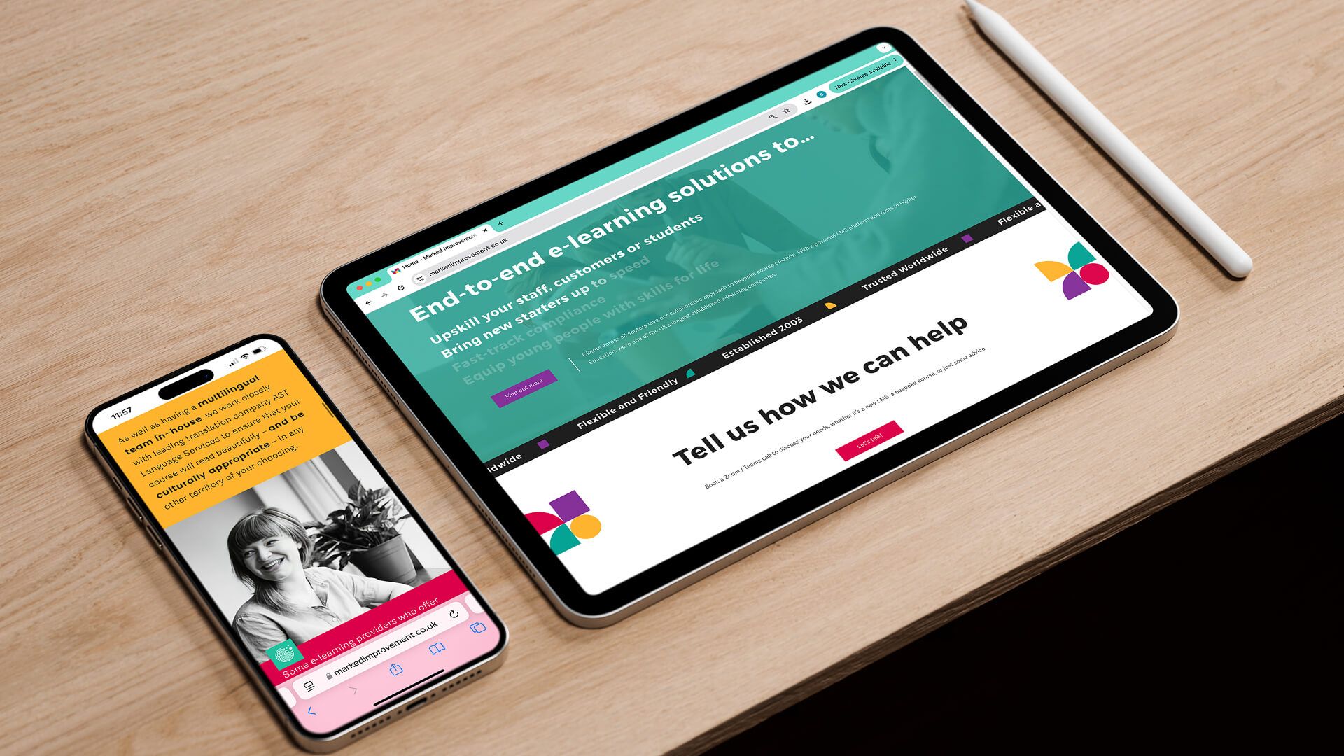
We built a blocky, geometric brand that looked like it could be plugged and played together, mirroring their modular learning platforms. A primary palette in vivid, punchy colour gave real standout against the more muted competitors. We extended it into an interactive event leaflet with spinning wheels, brand stationery, business cards, brochures and roller banners, and designed a website for the team to build.
The Outcome
The fresh brand identity stood out sharply from the competition and helped Mark's Improvement look more established, opening doors to bigger tenders and better opportunities in the e-learning space. It portrays the quality they deliver and gives them room to grow, another example of us handing clients strong, buildable assets and the freedom to take them forward independently.