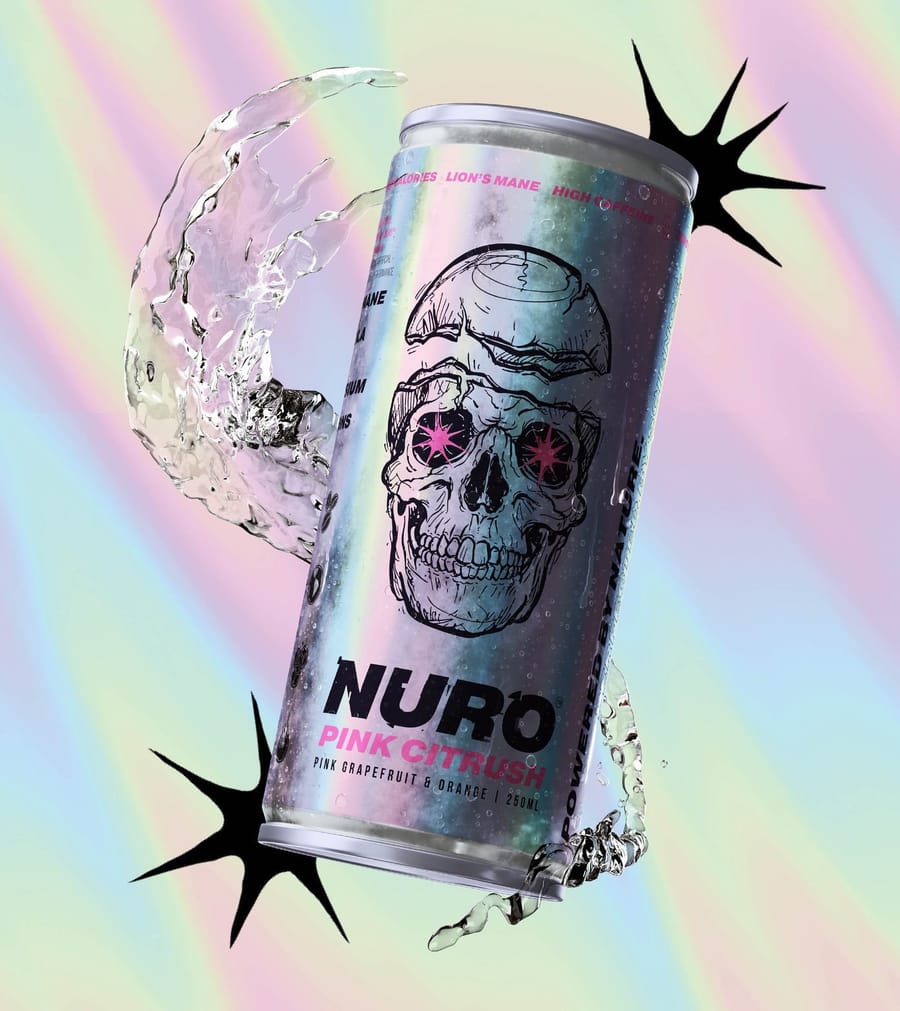
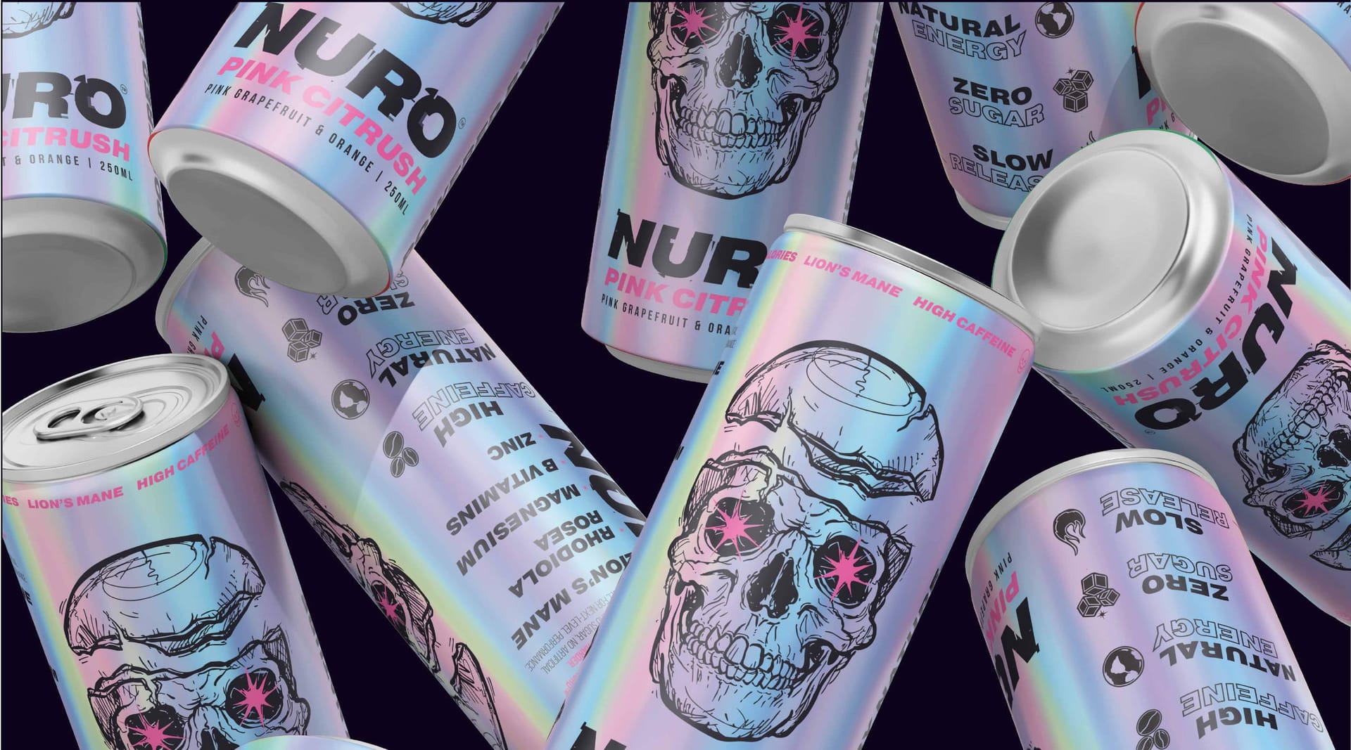
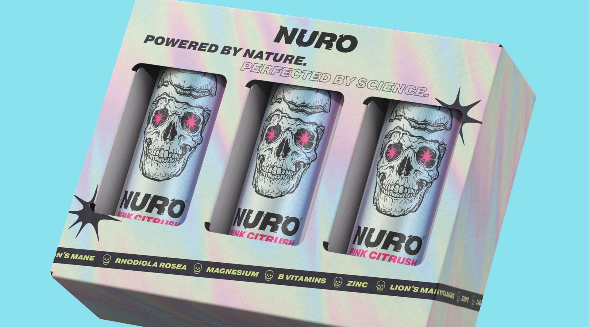
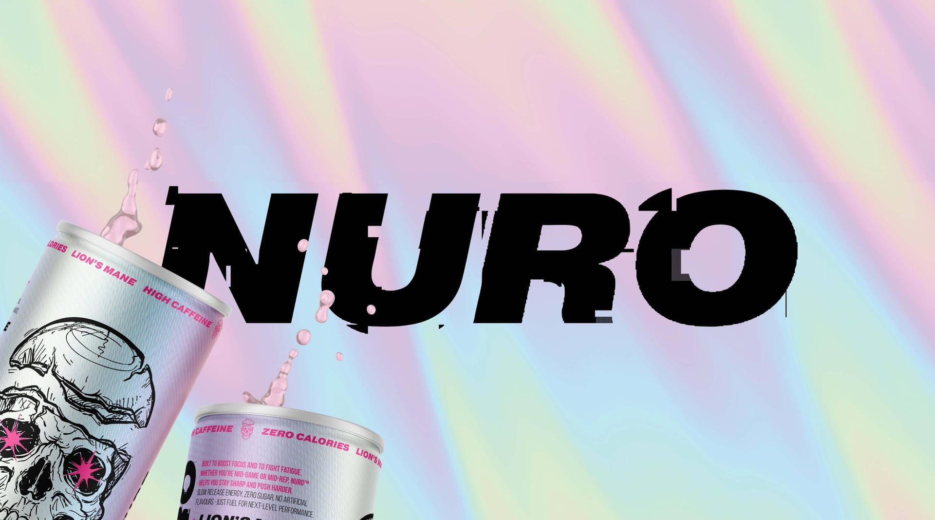
Nuro energy drink branding showing logo lockup and skull graphic cans on holographic background, packaging design by On Poynt Creative
Nuro2025

Branding

Fuel the focus, one neon can at a time.

The Challenge

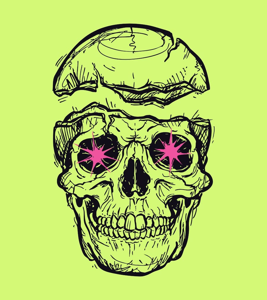
Neuro is a natural nootropic energy drink using ingredients like lion's mane to fuel both the gym and gaming markets, where lifters need energy for heavy weights and gamers need it for reaction speed. The team had a striking skull image in mind and needed a brand that could own the underexplored gaming space as well as the gym.

The Approach

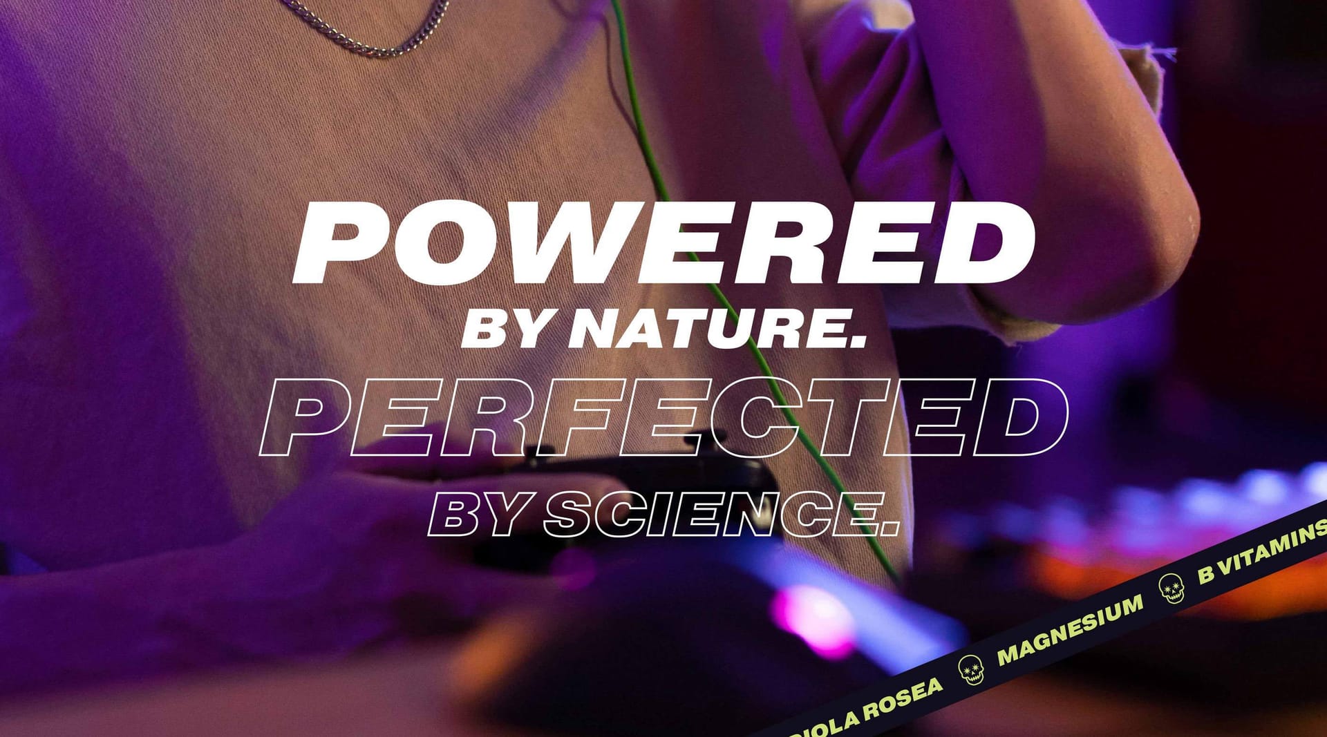
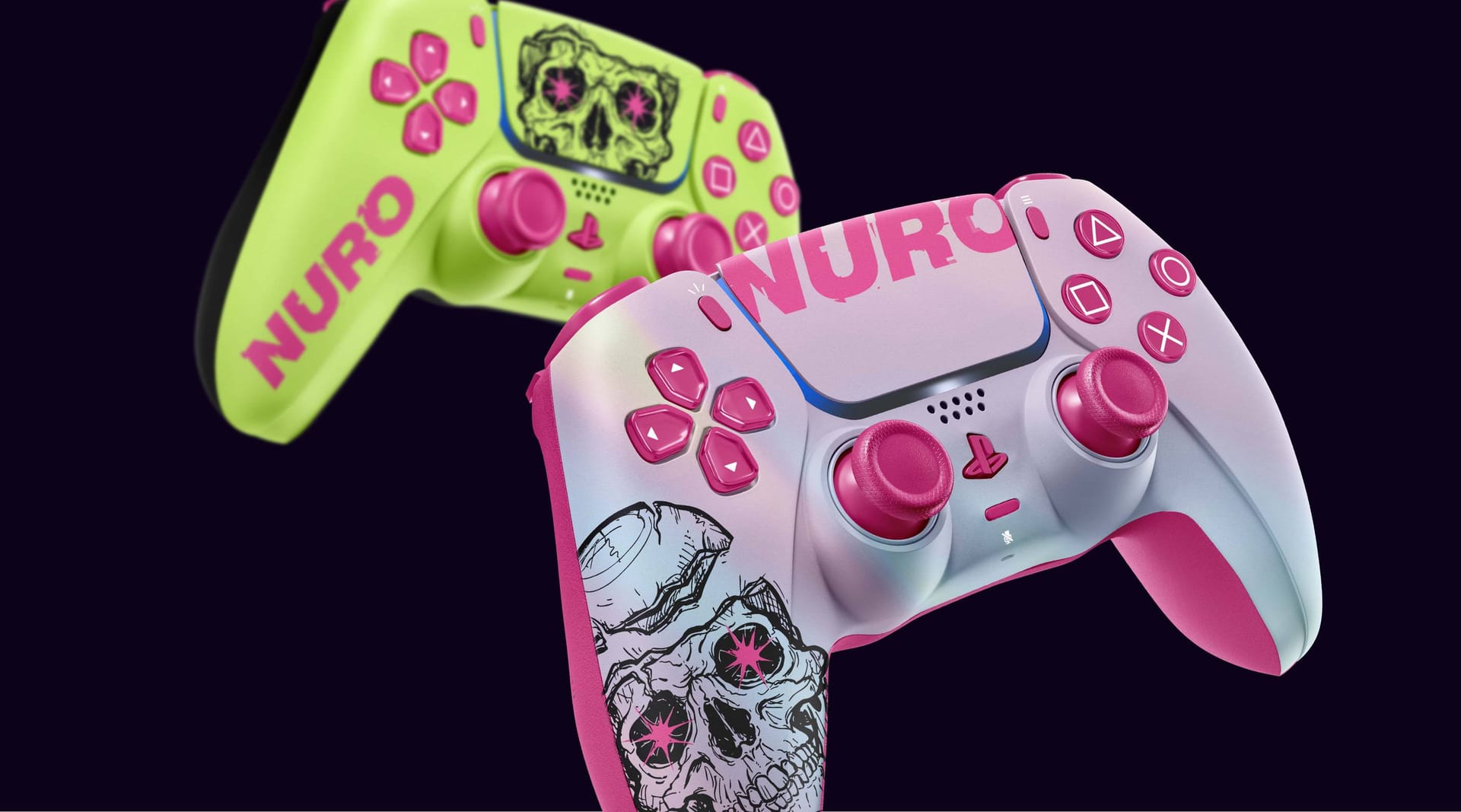
We worked that skull into an iridescent identity that popped in the dark environments where the drink lives, from gyms to bedrooms lit by a games console. Neon pink ran through the eyes, and the graphics fragmented like a video game defragmenting on screen. The tone of voice leaned into an if-you-know-you-know gaming culture, technical and moody throughout.

The Outcome

Neuro has become very successful for a smaller brand. We have gone on to develop their event space, designing a trade show stand and exploring brand activation, and they are now working with major names. It is a brand we feel we have real grounding with, built on foundations designed to help them attack the energy drink space with confidence.
Client perspective

n/a

n/s

Related work

View a similar project

Selected by category with a curated fallback so there is always something relevant to continue to.

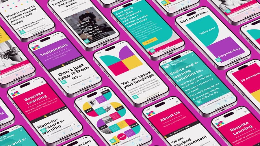
Marked Improvement mobile website screen designs by On Poynt Creative
Branding

Marked Improvement

A fresh, geometric rebrand for an e-learning platform that felt like it could be plugged and played together. Vivid, punchy colour gave real standout across event collateral, stationery and a website, helping the business win bigger tenders and look more established.

View Project
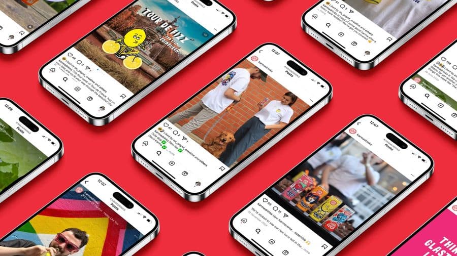
Social media marketing design for Karma Drinks by On Poynt Creative creative agency
Campaigns

Karma Drinks

Flexible marketing and graphic design support for a household-name drinks brand during a gap in their in-house team. We produced social campaign renders, imagery and video, and helped bring a major packaging refresh together into one cohesive new look.

View Project
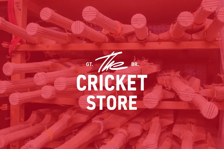
Cricket brand logo design and identity for The Cricket Store by On Poynt Creative
Branding

The Cricket Store

A marketplace giving club players the pro experience and small UK bat makers a route to a national audience. Traditional at heart, built to sell.

View Project
The Inside Edge logo design printed on textured card, branding by On Poynt Creative
Branding

The Inside Edge

A bold rebrand for a team training business founded by an ex-Army captain and England cricketer. Concrete textures, distress and sharp typography blend sport and military into one confident brand identity, complete with full guidelines built for future growth.

View Project
Endeavour Adventures website design displayed on laptop with mountain sunset backdrop, by On Poynt Creative
Branding

Endeavour Adventures

A scout-badge inspired brand refresh for a youth adventure holiday business. We updated the logo and built brochures, roller banners and social frames, giving a proven outdoor operator a fresher, more commercial and more trustworthy look built for growth.

View Project
Opal 22 Pop Up Poetry event poster design, by On Poynt Creative
Print

Opal 22

Illustration-led branding for a Leicester Black heritage charity's flagship Black History Month events. We gave each event its own identity across a brochure, posters, leaflets and merchandise, creating cohesive assets the charity now owns and reuses year after year.

View Project

CREATIVE & BRANDING AGENCY

WHERE CREATIVITY, STRATEGY AND PURPOSE CONVERGE TO BUILD BRANDS PEOPLE BELIEVE IN

2026®