A successful 'glow up', or a skin deep facade: The Bodycare rebrand evaluated
A couple of weeks back, Dan was away on holiday when Harry dropped a message into the studio WhatsApp group about the Bodycare rebrand. Harry liked it, or at least it was a massive improvement on what went before. Dan, from a sun lounger, felt otherwise. That disagreement carried on when he got back, so we sat down on the studio sofa and recorded it properly.
What one WhatsApp message taught us about why brands rebrand, and what a successful one actually looks like.
A couple of weeks back, Dan was away on holiday when Harry dropped a message into the studio WhatsApp group about the Bodycare rebrand. Harry liked it, or at least it was a massive improvement on what went before. Dan, from a sun lounger, felt otherwise. That disagreement carried on when he got back, so we sat down on the studio sofa and recorded it properly.
What follows is that conversation, tidied up. It starts with Bodycare, but it is really about the bigger question: why do brands reach the point of needing a rebrand, and how do you tell a good one from a fashionable one?
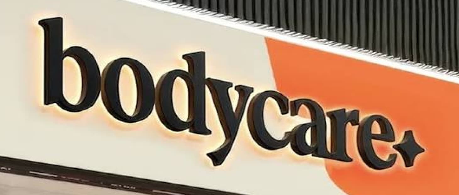
*A bit of context first.* Bodycare went into administration in September 2024, closing all 147 stores. An investor group led by Charles Denton, formerly CEO of The Body Shop, bought it out weeks later. It has come back in 2026 with a new identity and a new "Studio Store" format, and Leicester is on the list of openings.
Why does a brand get to the point of needing a rebrand?
Dan: Before we get to Bodycare specifically, what actually makes a business feel like it needs to rebrand?
Harry: I think it's when they realise that what they want from it isn't lining up with what they've actually got. That's a good time to do it. And I think Bodycare either changed what they were after, or they've looked at it and gone, right, we haven't got enough customers to keep doing this. So let's go younger. Go for people who are into fashion and make-up rather than hairspray.
Dan: And the honest version is that they were in administration. So there wasn't much of a choice.
Harry: Yeah, they weren't doing it for fun. Every shop shut. You can't come back with the same brand and expect it to go differently, can you.
Dan: Which is the bit people skip past. They didn't rebrand because the logo looked tired. They rebranded because 147 stores closed. So the real question isn't whether the new one looks better. It's whether the old one was ever telling anybody anything.
So what was the old one telling anybody?
Harry: Not a lot. I said in the group it looked like a hairdresser's, because it did. It had got to the point where it was a bit Supercuts. All black and white, and it felt like everyone working there was a hairdresser.
Dan: If you looked at the old Bodycare, you expected everything in there to be aimed at over forties and everyone serving you to be over sixty.
Harry: Every time I went in it was Tresemme, hairspray, holiday minis. Travel bits. That was it.
Dan: Is it fair to say it never really appealed to anybody? It's a hard thing to say about a business, but some businesses don't really have a brand at all. It felt like a slightly better Savers.
Harry: It's the B&M of beauty.
Dan: The B&M of beauty. Although B&M has more personality than that.
Harry: Well yeah, that's the thing. It just looked dark and miserable. Grey ceilings, grey shelves, grey everything. Nothing about it made you want to be in there.
Dan: And that's the honest diagnosis. If you'd asked me three years ago what you go to Bodycare for, I couldn't have told you. Men's section was a wall of identical deodorants. Women's section was hairspray. Then face masks and travel bits. Who is that shop for? Because if your customer can't finish the sentence "you go there for...", somebody else is finishing it for them.
Harry: So they've gone and found something to finish it with, haven't they.
“And they've found a real gap, to be fair”
Dan: On the piercing studios, I think they've seen something real. All the way through the noughties, a rite of passage for a twelve year old starting secondary school was going to Claire's Accessories to get their ears pierced and buy their first pair of earrings. Boys as well. Claire's has gone from the UK high street now, and that gap has just sat there.
Harry: Maybe, although Claire's at the end wasn't the Claire's we grew up with. Ours was little girls, cheap bits, key rings you'd stick on your bag. The later one was trying to be a bit more grown up.
Dan: Either way, there's a destination missing. And Bodycare have worked out something else too. Boots and Superdrug are the staples of the British high street, and they'll be among the last shops standing. You can't beat them head on. So you find the bit they don't serve well, which is younger customers buying less expensive cosmetics.
Harry: And they've actually done make-up properly now. K-beauty, fragrance, piercing. Basically all the stuff the old shop wasn't.
Dan: I don't argue with any of that. The strategy is there. My argument is with what they've built on top of it.
Where we disagree: is there anything underneath it?
Dan: Here's my problem. Starting a brand from nothing is one thing. You're new, you're exciting, you're the David among Goliaths. Rebranding is harder, because you're fighting your own history. People remember the hairdresser's shop. So the new one has to be watertight.
And what I see is a brand that's a bit skin deep, pun intended. It doesn't have the expertise or the breadth of product or the tradition that Boots has. It sits halfway between a B&M and a Boots. In store it feels like a Flying Tiger version of a cosmetics shop.
Harry: There's a market for that though. Flying Tiger does alright.
Dan: There is, but it's a transactional market. It's low margin and it isn't about experience. And in a category where experience is everything, that worries me.
Harry: See, I'd argue some people don't want the experience. If I want a mascara that does the job and it's cheaper, I want to walk in, grab it, scan it myself and go. Lush is the other end of it, and Lush is Marmite. I love washing my hands in there, I do, but there's always someone at the door going "hiya" and I'm thinking, please, I know what I'm here for.
Dan: That's fair. And maybe that's the honest read on both of us. Two men of a certain age looking at a brand built for someone else.
Harry: And whoever it is built for isn't walking past it anyway, are they. They're finding it on their phone. Which is the whole point of the studio thing.
Dan: The stores have a creator space. Free filming equipment, live broadcast studios, a Bodycare Academy training creators. And they launched with flash mobs outside the stores.
Harry: The dancing was cringe.
Dan: Yeah…but…
Harry: And yet here we are talking about it. If it hadn't been cringe I'd have gone "oh, Bodycare's opened", seen a few balloons and scrolled straight past. Instead everyone filmed it.
Dan: So it worked, on its own terms. My worry is different. Successful creators need original content, and original content has a very short shelf life. If every video is shot in the same corner of the same shop against the same backdrop, that gets stale quickly. I think the studio ends up being a kids' party space rather than a serious creator destination.
Harry: Yeah, you're probably right on that bit. I can see it turning into the games corner in Game, where nobody's ever actually in it. But that's still how that customer finds stuff now. You never see anyone going "look what I found in Boots", do you.
Dan: Alright. So put a number on it, out of 10 how successful is the rebrand?
Harry: If five's bang average and one's shocking, I'd say about a seven. They've done a good job. You know what they're going for. Needs a few tweaks at some point, but I reckon they know that.
Dan: I'd go lower, and here's why. A good rebrand should buy a business longevity. The buzz means Bodycare looks successful in the short term. What I worry about is what's underneath it. Their demographic moves fast and moves on fast. I can't picture many people over seventeen going in, and that's a very narrow slice of someone's life.
Harry: For a business that was in administration though, staying alive is the win. Get the buzz, survive, then sort it out properly. Leeds United went into administration, got bought at the last minute, spent a few seasons just surviving. Nobody was marking that first season out of ten.
Dan: That's the fairest thing either of us has said. Survival first, then substance.
Harry: And you don't get the second one without the first one.
Dan: No. But you can absolutely have the first one and never get round to the second, and that's the version I'd be nervous about if it were our client. A visual language that is perfectly of 2026 is, by definition, going to look like 2026 in 2029. Fine if you've planned for it. Expensive if you haven't, because doing it twice in five years costs you the credibility you just spent the money buying.
Harry: We'll know in three years, won't we.
Dan: Watch that space.
On Poynt Creative is a branding, design and web studio in Leicester. If your brand has stopped being able to finish the sentence "you go there for...", that's usually where we start.